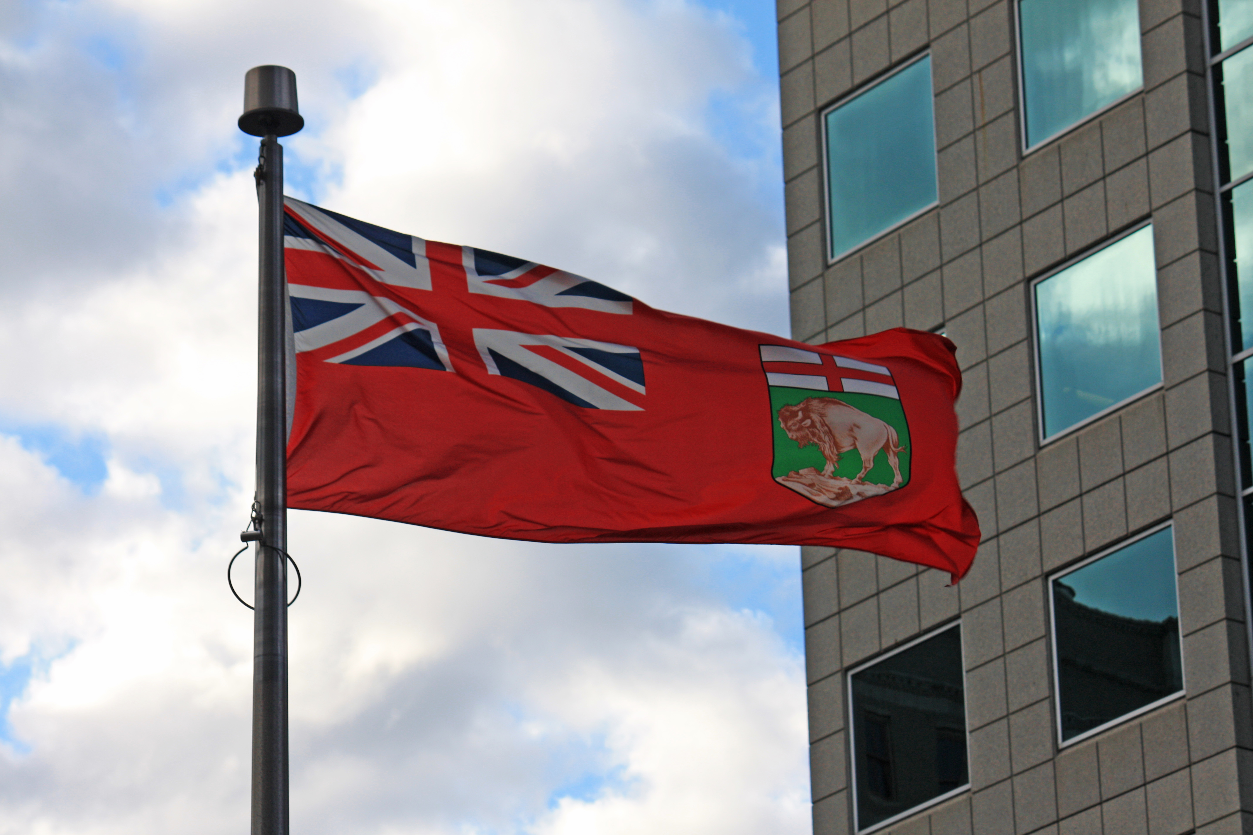
 I dislike the Manitoba flag. I have for years. I first noticed how much I disliked it back around 2001. I was sitting in the parking lot at Superstore waiting for my spouse to pick something up when I looked at the flags flying there. We had just moved back from Saskatchewan that March and it struck me how much more the Saskatchewan flag stood out compared to the Manitoba one. Superstore there flew the Canadian and Saskatchewan flags, while here it is Canada and Manitoba.
 I love the Canadian flag. Despite its relatively recent adoption in the late 60s, it is a wonderful symbol of our country. At once unique, simple in design, and unmistakeably Canadian. It is a wonderful flag. The Manitoba flag, not so much.
How do I know that it was 2001? Well, in June of that same year, the North American Vexillological Association (NAVA), a group dedicated to the study of flags, released a survey of their members on the flags of North American States and Provinces. We beat many states, but as far as Canadian flags go we were dead last.
Just looking at the thing, I knew it wasn’t a good design. It was kind of just intuitive. After NAVA’s survey I knew why. From their website at Nava.org:
The 5 Basic Principles of Flag Design
- Keep It Simple – The flag should be so simple that a child can draw it from memory…
- Use Meaningful Symbolism – The flag’s images, colors, or patterns should relate to what it symbolizes…
- Use 2–3 Basic Colors – Limit the number of colors on the flag to three, which contrast well and come from the standard color set…
- No Lettering or Seals – Never use writing of any kind or an organization’s seal…
- Be Distinctive or Be Related – Avoid duplicating other flags, but use similarities to show connections…
Using those basic principles it is easy to see why the Canadian flag is great flag design, and the Manitoba flag is not.
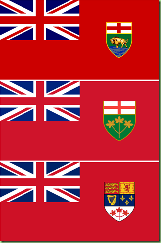
First, Manitoba’s flag (top) probably is fairly simple until you get to the coat of arms on the right hand side; then the thing gets overly complicated. It uses way too many colors , and worst of all, it is not distinctive. It is terribly difficult to tell apart from a number of other flags in Canada and the Commonwealth both historically and current.
It also not only duplicates the flags of Ontario (centre), and the Canadian Red Ensign (bottom), but all three actually contain the Union Jack from the United Kingdom in its entirety.
Worst of all, it is not distinctive. Fly any of those three flags to the left, and on a calm day you would not be able to tell them apart. That’s not even taking into account all the uses of the Red Ensign design outside of Canada. Sure, the flag does represent our history by using those symbols, but it ignores all the other peoples who have contributed to this province.
Because of its non-distinctive nature, the flag fails its most important role as a symbol. I look at the flag and it does nothing for me. It does not cause any feelings like those of the Canadian Maple Leaf flag. At least when I look at Saskatchewan’s flag, I see how it says “Saskatchewan.”
 So, in 2001, after the news of NAVA’s flag rankings broke, I wrote to the Winnipeg Free Press and I suggested that they hold a contest for a new Manitoba flag. I included my idea for a Manitoba flag as seen to the right. I knew that the eventual winner would most likely not be adopted, but the Free Press ran with the idea anyway. My design was to keep it simple, at least simple enough to design in MS-Paint! The blue was to represent our northern lakes and expansive skies while the green represented our vast prairie landscape. The bison of course is a well used symbol of our province going back many years. It was also meant to have a similarity to the flag of our western neighbour Saskatchewan who we share much of our identity with.
My entry if I recall correctly made the top 10, which I was pretty happy with.
I do have to admit though, that I instantly fell in love with the winning entry, from Heather Jones of Winnipeg. I would be proud to fly it. It is distinctive, it is meant to represent Sunny Manitoba and the inclusion of the bison uses one of our most recognizable symbols. It has been suggested that the bison be reversed so that it is facing the flagpole as to not be considered rude, but other than that, it is perfect. I’d actually like to buy one to fly it.

